Love the gadget, not too keen on the editor

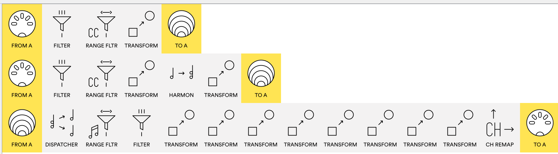
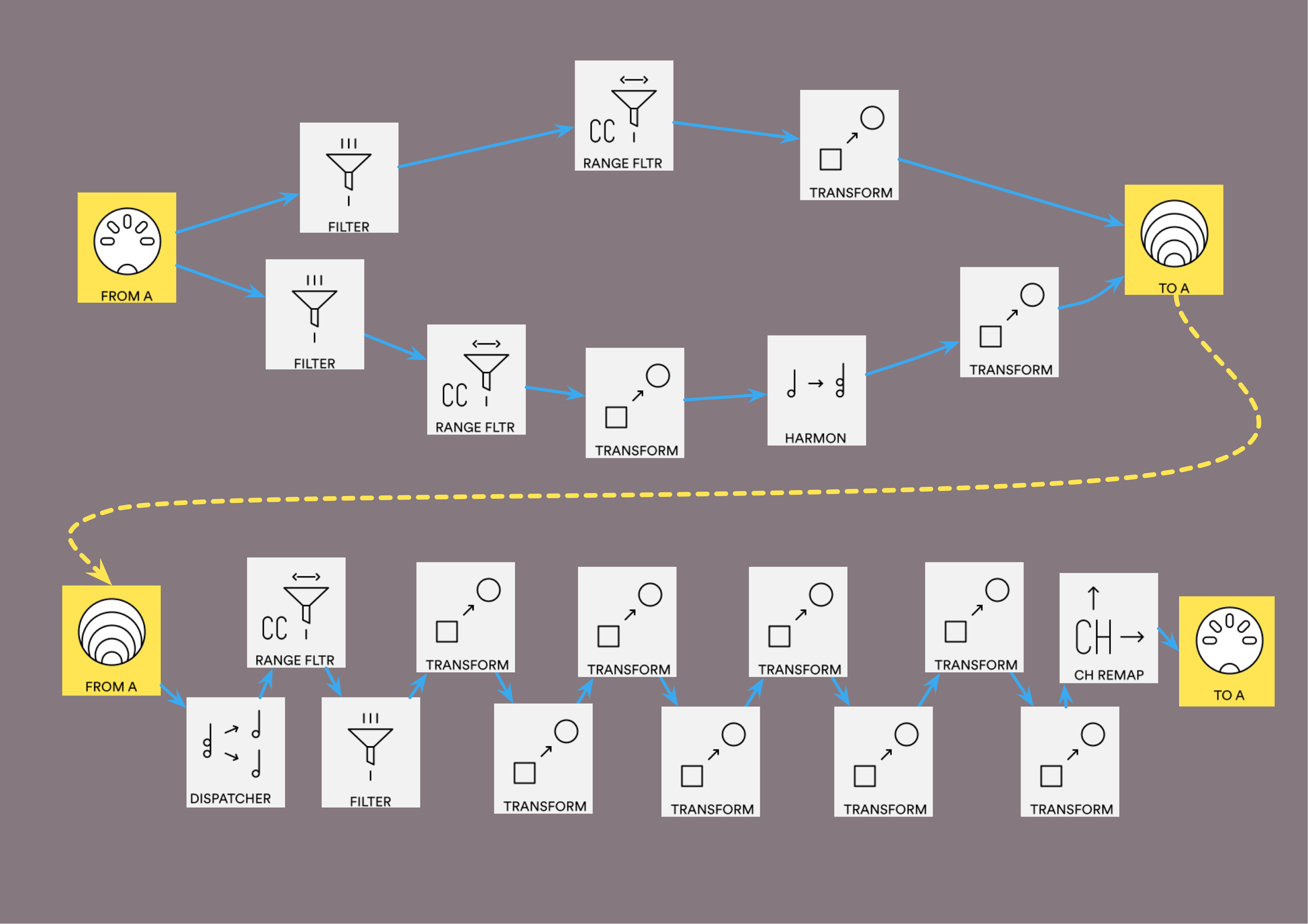
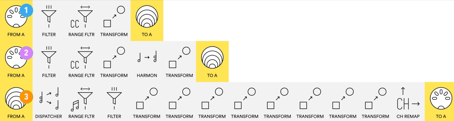
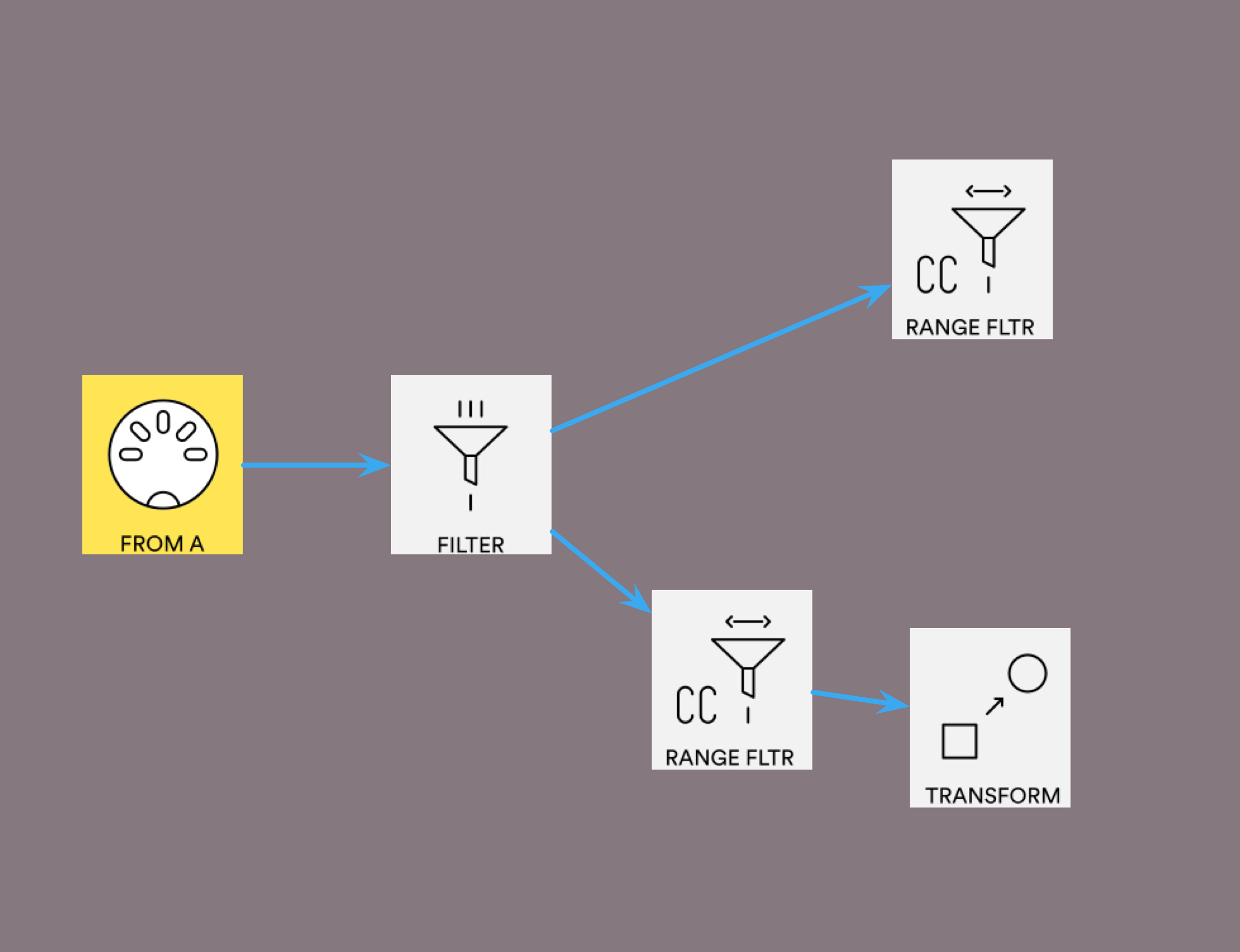
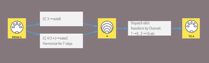
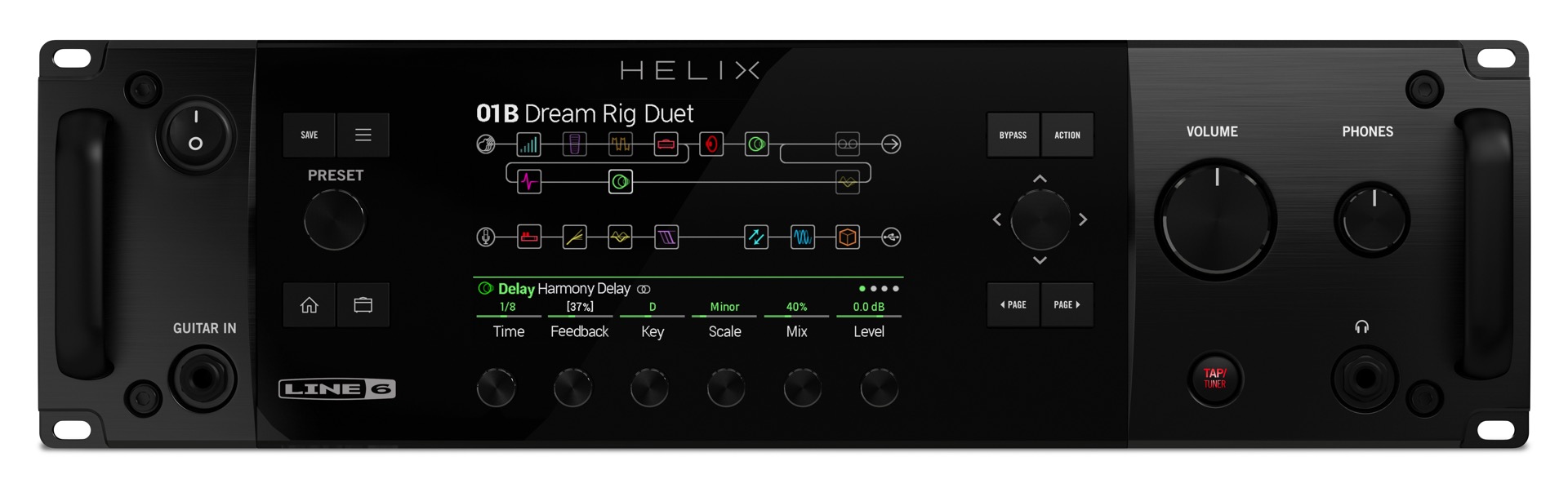
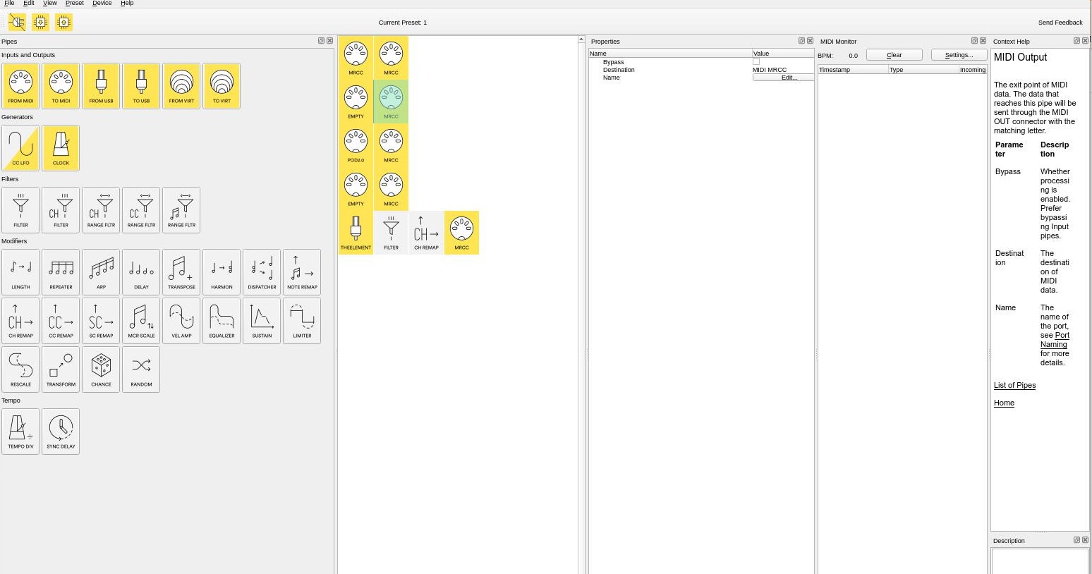
I find the editor really opaque to use. If I contrast its design with the layout of the display panel on the Line 6 Helix Rack, the latter is so easy to use, the eye can sweep once from left to right and understand the entire signal flow in one go and this has numerous hardware inputs and outputs plus the potential for multiple complicated signal paths. Using the editor feels like using an old patch bay or modular synth, to understand where a signal is going, you have to follow each wire and see what the socket is labelled and then build up the signal path in your mind each time. Today, I wanted to process each of the 16 channels differently, so this requires me setting up a vertical column of 16 individual filter blocks between in and outs and if I want to start sending them off to other places it’s going to require loads of vertical scrolling and scribbling of notes to keep track of what goes where. And that would be just for input A to output A. To my mind, signals flow from left to right, ‘in’ is on the left, ‘out’ is on the right. It would be great if we could connect stuff with magnetic lines that can be defined like the filters, transformers etc, like Audio Midi Setup on the Mac.

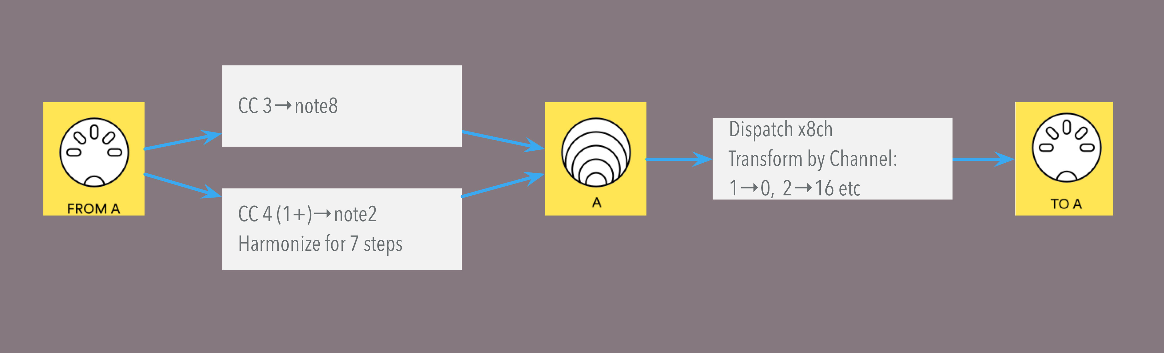
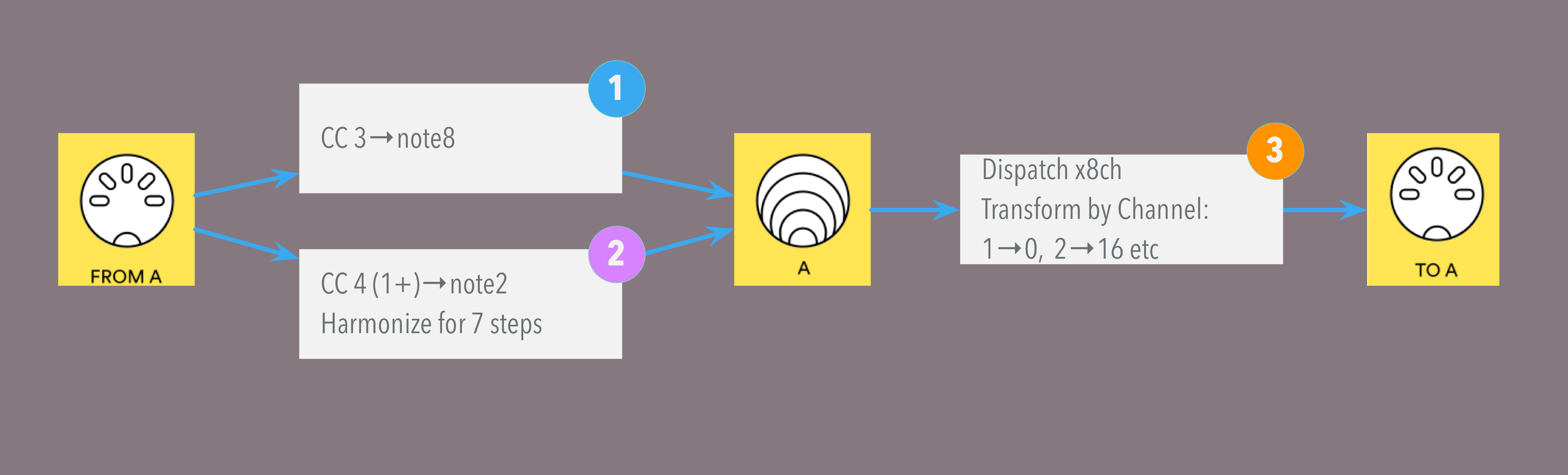
I noticed the word ‘argument’ in the CC transformer section, I’m assuming this is a mathematical or engineering term, I looked it up but couldn’t find anything, I’m only a guitarist so I just fiddled around until it did what I wanted. If it means ‘number’ that would be clearer for dopey guitarists like me.

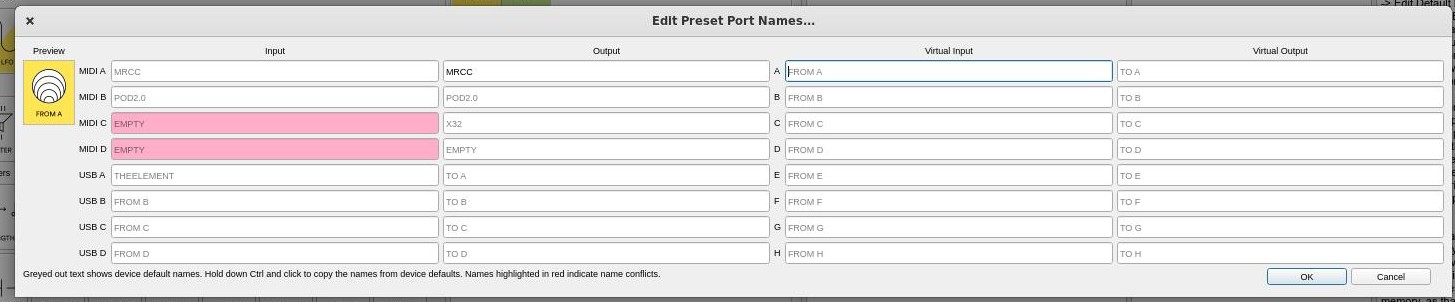
The editor has a pane called ‘description’ this has remained resolutely blank so far, there’s a lot going on in the editor window, could this area be better used? There are two buttons below that are marked ‘view’ and ‘edit’ that haven’t done anything useful so far.

Could there be key commands for the different presets? Many users might be unaware that they can be assigned in the Mac system prefs.

As I said, I LOVE this gadget, it is going to solve all my MIDI woes but the editor feels like it has been designed by someone with very large side burns and a substantial collection of oscilloscopes at home. I’m not trying to be a dick but the editor could put people off, I reckon.

2 Likes

Hey, thank you for the feedback. :slight_smile: We plan to make some improvements for easier understanding of what the presets do, like in-place comment sections and port naming.

It’s a constant value (variable if it’s MIDI mapped) you could choose to use in the resulting transformed message, if it’s selected to be used via [Value for Byte n] properties (the name of this selector property is context specific, like ‘Set CC Number To’).

On Description - it’s a place for documenting your preset for your own future reference, or if you intend to share it with others, sort of like a Read Me file. You can edit it while in the ‘Edit’ tab, it uses Markdown syntax for formatting, the View tab shows the formatted contents. You may turn that widget off using View->Description option (or F2 key).

Could you share a list of suggested hotkeys to access the presets that you’d find convenient? :slight_smile:

Barber shops were closed in these quarantine times! :smiley:

2 Likes

I just assigned command 1, command 2 etc but it made all the presets look like the same pipe combination, possibly the last one I was working on. I haven’t tested whether they all now function the same too.

If you assigned the ‘Store’ actions, then the currently open preset would overwrite the slots. To switch to another stored preset, create hotkeys for the Load actions.

I see the problem now, the menu entries (Preset x) in ‘store’ and ‘load’ are identical so the system can’t distinguish. I have run into this very problem with Guitar Pro too.

1 Like

@Giedrius one type of visualisation I’d love to have is some kind of graph, I’m using my Midihub as a router and the different presets route different channels from different INs to some virtuals that then merge to some of the OUTs, I’d love to have a graph representation of the flow MIDI A/B/C/D -> virtual A/B/C/D -> OUT without having to peek through each MIDI -> virt to see if I set the correct channels/inputs. Had quite a few bugs on my custom presets because I missed changing a property here and there due to the columnised visualisation.

4 Likes

I agree. Currently it’s hard to get a workflow going. It’s not engaging. I think “ugh” when opening the editor. I wish I could think “great now let’s do this”. The gadget allows me to achieve what I plan to do, but actually using it feels like playing a game of mikado with a box of spaghetti. COOKED spaghetti. Anyway, thank you for your hard work!

4 Likes

Although some of the comments and suggestions are interesting and I’m sure the MIDIhub editor can be improved, to me, the editor as it is currently implemented looks clean, neat, well presented both visually and functionally, and is easy to understand. In addition, it works great in Linux, for which I’m grateful.

4 Likes

hey, @stratblue Nick,

I wonder how may users share your view :arrow_double_down: ?

I thought a consideration on your points above would sit nicer here than in the more general ‘Editor Suggestions’ thread.


I’ve been thinking about @otzcz suggestions on and off, since they were made then expanded on;


your comments:

…a glorified midi merge these days. I open the editor and my heart sinks…

concerned me so…


Using a Giedrius patch as an example

(from here)

Change scenes with footswitch - #14 by Giedrius
with this layout

I made a swipe at trying to depict it as a wire diagram:

I’m not sure if this is what you mean, but IMO is raises a bunch of questions

for example
  • would the layout be auto or draggable (with multiple selections)?
  • would there be a max num pipes per line?
    (here I’ve scruffily squeezed 14 onto a line, but I’ve seen patches with over 70 pipes in one pipeline).
    And most importantly…
  • …while it may give a better sense of flow,
  • how much does it aid understanding of what the patch does when one returns to it?

Would a dynamically self-adjusting layout help you patch more intuitively?


I then went on to think about just creating a summary wire diagram:

or to link to the 'patch' view better:

with a line numbered ‘patch’ view:

the ‘pipeline descriptions’ could be pulled from the Description Panel in a similar way to what I floated here:

Given @Giedrius’ comment about the Editor…

…I dunno whether this could be implemented in a less memory-heavy way.

:arrow_double_up: @steve777’s comment (back in 2020) and the number of people who ‘liked’ it then suggest that some people are happy with the Editor broadly as it is. I wonder how much of a game changer a more graphic layout would be?


PS. Based my thinking more on your comment, Nick, as @otzcz’s ideas suggest something like this…


…which would mean a different Midihub architecture

1 Like

PPS. @Giedrius, if you think the above belongs back in the Editor Suggestions thread, sling it back there and I’ll edit accordingly.

image
This is how it looks in my mind, each box would pop open as you clicked on it to show you what it does.

Just like my Helix rack!

1 Like

Oh boy, these pictures are from my dreams :)) But seriously, as I mentioned here , matrix table like this:

|Jk| Msg Filter   | Cable IN 1111111 | Jack OUT 1111111 |
|  | Ch Sc Rt Sx  | 1234567890123456 | 1234567890123456 |
|1 |  X  X  X  X  | ................ | XXX              |
|2 |  X  X  X  X  | .X.............. | ...              |
|3 |  X  X  X  X  | ..X............. | ...              |

where I could clicking on joint points to enable/disable routing or filtering, would be huge improvement too. “Programming” using this way could be faster literally for everyone, IMO :slight_smile:

Wouldn’t be so sure of that! people think & see things in very different ways: you can bet the different styles shown above would lose as many as they would help.

One of the challenges that the small Blokas team have is to make Midihub accessible to the ever wider audience it has…
…I think that’s a non-trivial task!

1 Like

OK, imagine it was ‘expandable’ as you describe: would that replace the "standard grid view’ IYO or be an alternate view?

Now let’s say that wasn’t possible to incorporate that into Editor with Blokas’ current resources & priorities: would some clunkier applet which would create a static graph from a .mhp file be a halfway-house? (do an image search for “graphviz python” to see what might be possible at a fairly amateurish level)

Hopefully it would be the only view.

I’m not sure really, I guess it would depend on the implementation.

I’m not trying to initiate any kind of ‘pile on’ here, independents like you guys are vital, I have a Genoqs Octopus, an MRCC, Electra One and a Midicake ARP, if I faced a future of sitting in front of a laptop running Ableton I’d take up accountancy instead, so thank you. I opened up the editor again yesterday, it’s been a few months at least, to have a look around and it just seems so weird from a human user interface point of view, all those squishy panels I can move around which means that no modifier is ever in the same place, I always have to hunt for what I want, I always feel I have to move a border to make sure a modifier hasn’t slipped ‘underneath’ the next panel over (the only panel that doesn’t appear to have a title), like a lost Scrabble tile, I know it hasn’t got ‘lost’ really but I always feel like I have to check. I remember having to constantly move those borders left to right and back endlessly so I could read the descriptions, see my pipelines, then find the modifier I wanted without having to scroll to the bottom of a list of filter/modifiers that’s only 1 pane wide.

On this screen shot why do I have to have port 1 (MRCC) 4 times? It’s the same port. I know I could use a virtual pipe/port solution to get round this but in real terms that’s no different.

What’s the deal with the port naming? I see default ports that go red and purple, sometimes they’re greyed out. What’s plugged in is what it is, why are there two naming schemes?

I opened this panel again today:

I don’t really know what to do with it apart from type stuff in and see what happens. If there are two naming schemes, which one does this address? I don’t see these names in my preset in the first screenshot.

Forums like this are obviously populated by total brainiacs who can install Linux while simultaneously working out the square root of imaginary numbers and I’m sure they are reading this and thinking ‘What a dope, it’s so simple’. I’m a guitar teacher among other things and I’ve realised that stuff that seems blindingly obvious to me, really isn’t to the vast majority of my students.

I have a dream of an 8in/8 out Midihub directing streams of elegantly crafted midi notes through various delays, pitched and harmonised, modulated by chance and all sorts of other stuff. I could map my Electra One to parameters in the Midihub and actually play it like some mad genius.

That would be amazing.

The editor’s layout is saved between runs, every time you open it up again, all the panel dimensions should match what you had just before exiting the program. I personally have the pipes list window as wide to fit 3 columns of pipe icons, and scroll up or down to access the necessary pipes. The pane without a title is actually not a pane at all, but the main document/canvas, which is always there. If some line is too long to be seen, horizontal or vertical scrollbars will appear.

Check out the documentation at Port Naming - Midihub Documentation for information on default port names and preset port names, as well as the dynamic tooltip label at the bottom of the dialog with hints on the color meanings.

You see the pink color as an indicator that you have named MIDI IN C and MIDI IN D to the exact same name, it’s a sort of a warning, letting you know it may be confusing. In case you don’t have anything connected to those ports, you’re free to ignore the warning.

hey, Nick, I’m asking “what-ifs” cos I’m wondering –as a fellow user– whether any helpful amateur’s contributions might be a stand-in in case Blokas don’t make a new Editor a high priority
(personally, much as I might like extra layout options, deeper mapping functionality and other Clock-based capabilities would be my priorities for @Giedrius’ & @Pranciskus’ time!)

Mom always told us: “why do it simply, when you can do it complexly” … and this way of thinking strongly reminds me of it :slight_smile:

…but some survey would be better than speculation.

the ideal approach could be an editor based on open source, on which the whole community could effectively collaborate… the development of the application could then be many times faster than it is now, when the user writes a request in the interest of a better UI/UX/workflow and the answer is about “complicated /can’t/we are few and there is a lot of work”.